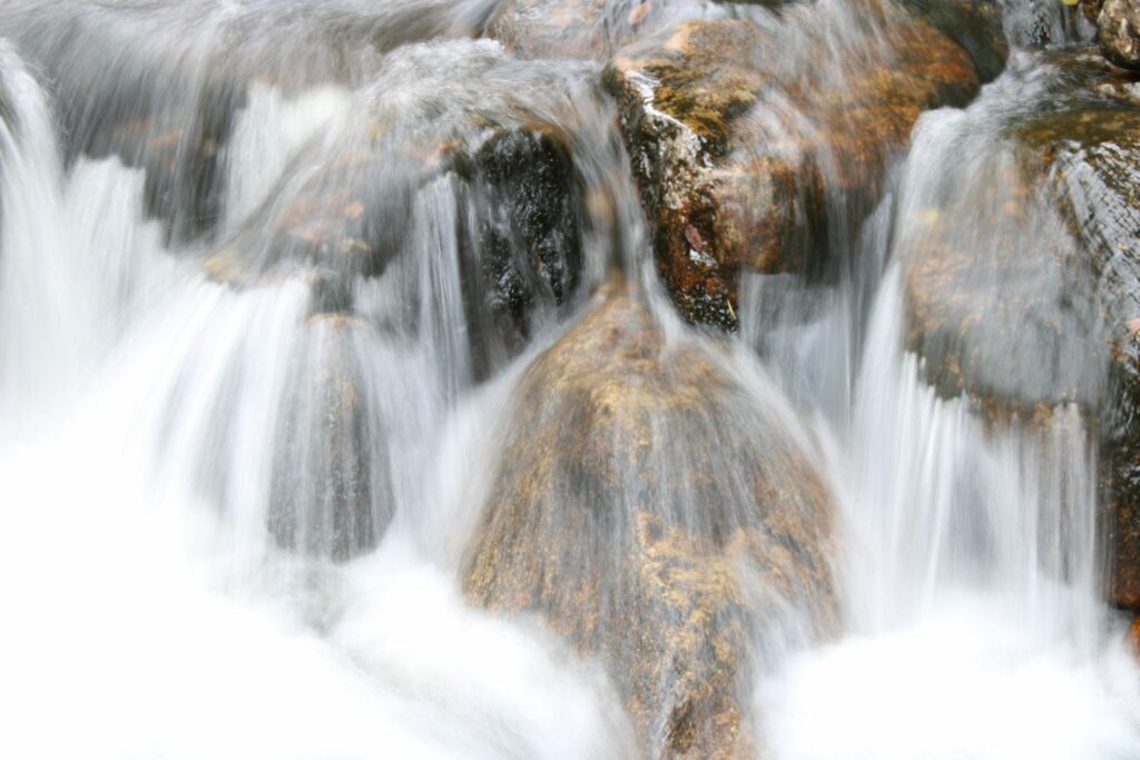
Illustrator and graphic designer
In this task we had to design a brochure showing four important periods in the history of graphic design. These four periods were:
We also had to create four graphic elements showing the style from these four periods.
I tried to keep the style very simple with a few colours and a structured layout.
For the posters I tried to create something to present each style.
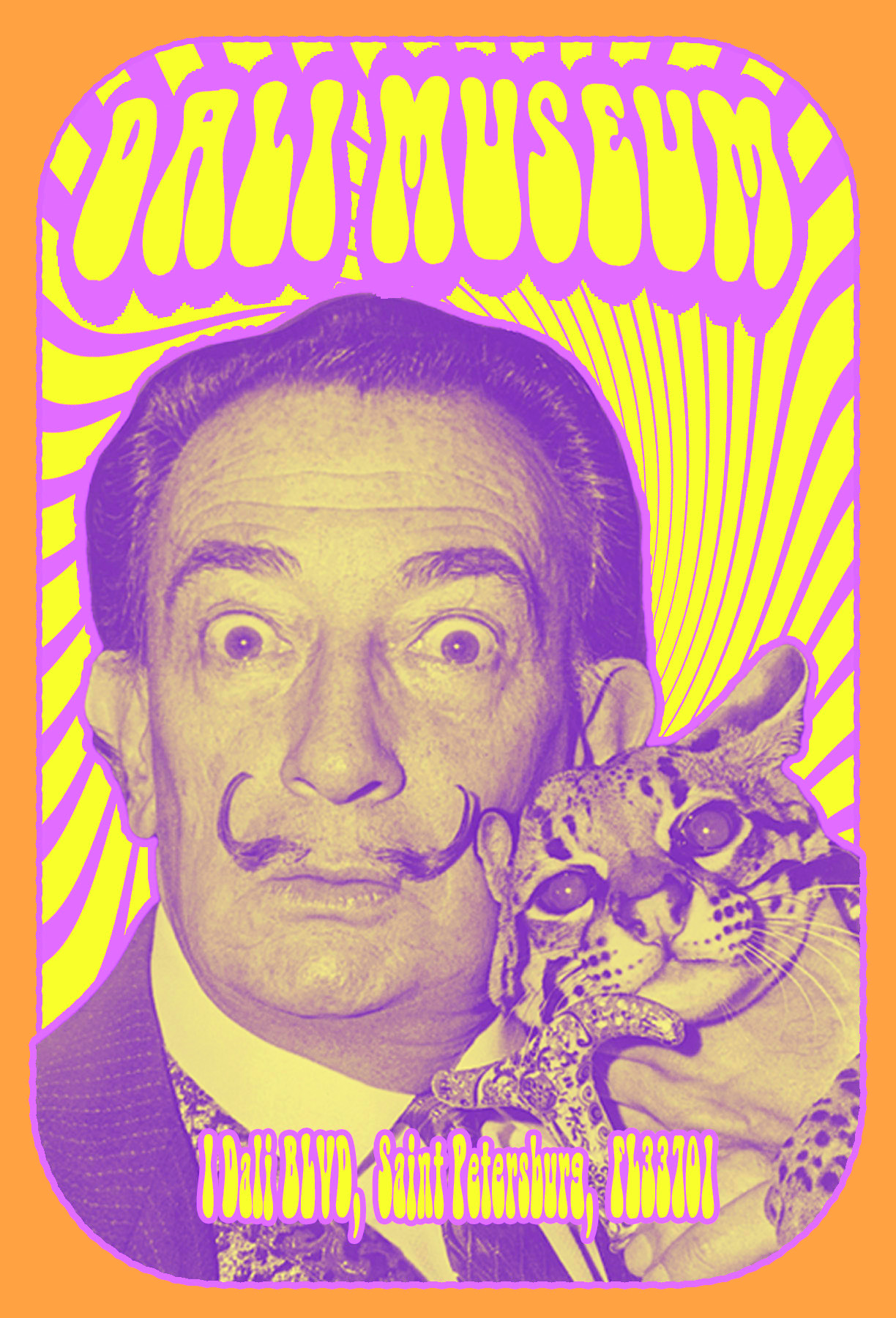
The reason why I used Salvador Dali for the psychodelic poster was because he is quite an odd artist and he was very active in that period. His art even has the same weirdness that psychodelic posters have.
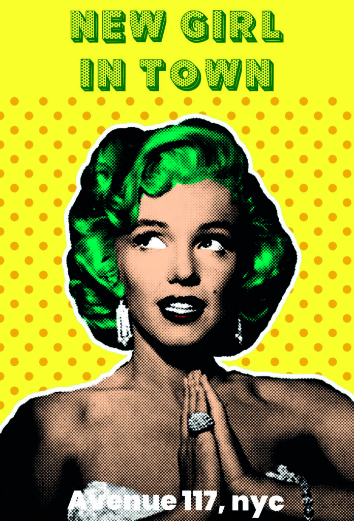
I used Marilyn Monroe as the main object on the pop art poster as she is easy to make in the pop style (also very popular, so I might not have been very original!), and still look good.
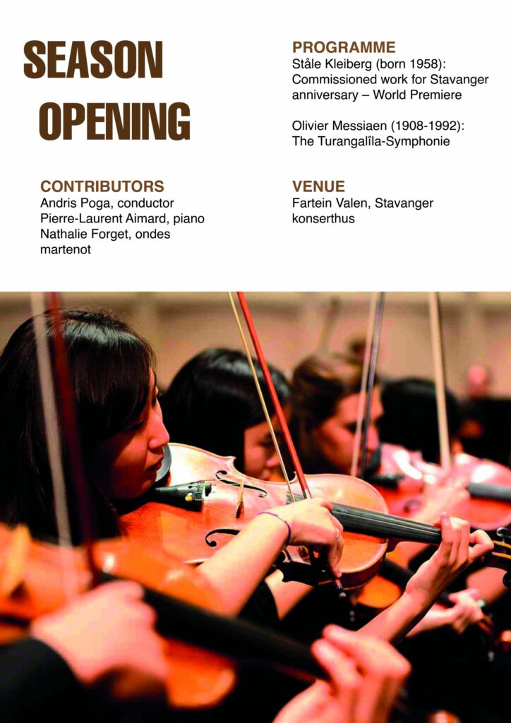
For the Swiss style I created a simple concert poster, with a structured layout and Helvetica as the font.
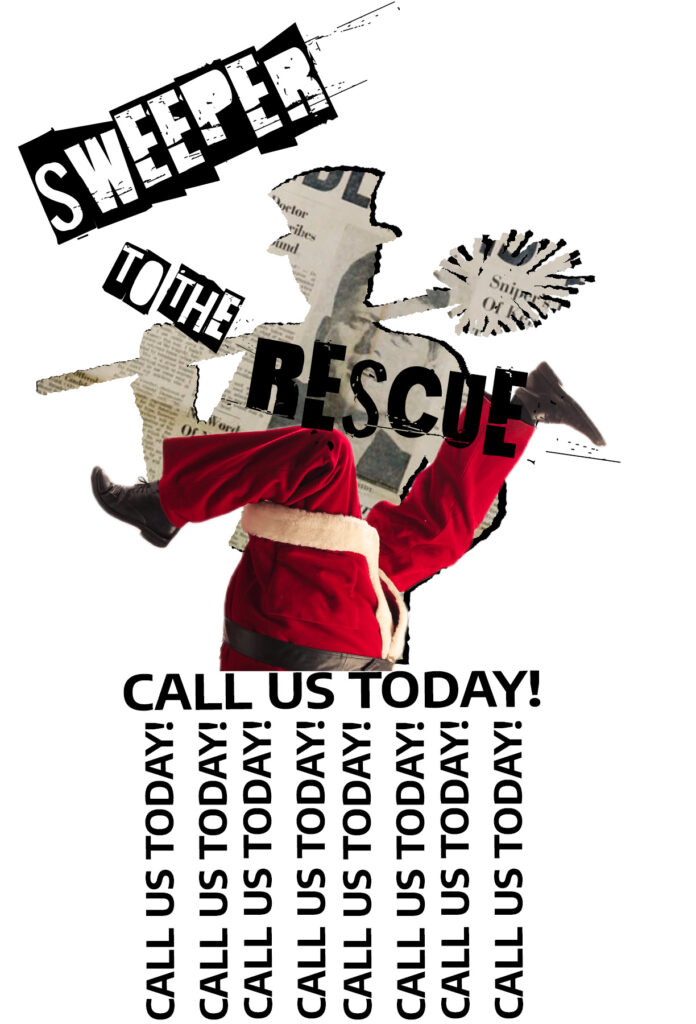
The idea behind the New wave poster was to create something funny and ironic. The concept was: what happens if santa get stuck in the chimney and who will save him?

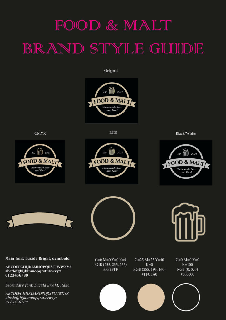
In this task we are to design a logo for a food company called ”Food & Malt”. We had to research the term of dude food and the product history and characteristic, to understand what kind of logo we should make. The logo should be easily recognisable, simple and have max three colours. The purpose of this task was for students to research logos, competitors and their target groups.We had to produce the logo in three different colour types, CMYK, RGB and black & white, for printing.

In this task we had to create a online menu for a resturant client. We had to find our own images and design by using HTML and CSS.
My biggest challenge was to align the items. I first used flex box but then I was introduced to grids and started using that instead. I also tried to filter my items with Javascript but I never achieved this as I am not familiar with Javascript.
One of my earliest ideas included using Flip Cards on every menu. But I figured it might be frustrating and not productive. The idea was to have the image, name and price on the front and the ingredients on the back. But, as I didn’t know where to put the “Order” button, I decided not to.
My other idea was to use Javascript to filter the menus into different categories, inspired by Dolly Dimples, but even though I copied the code from W3Schools.com, it never worked like I
wanted. The tutors couldn’t help as we weren’t supposed to learn Javascript in this module, so I eventually removed it as well. After much back and forth thinking I eventually settled on my current design seen on my page.

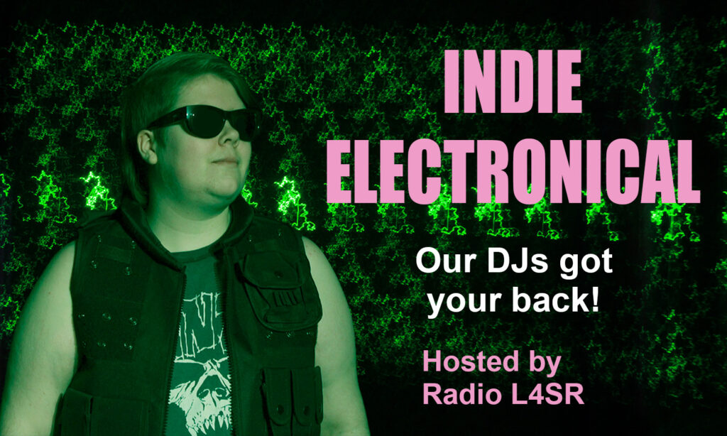
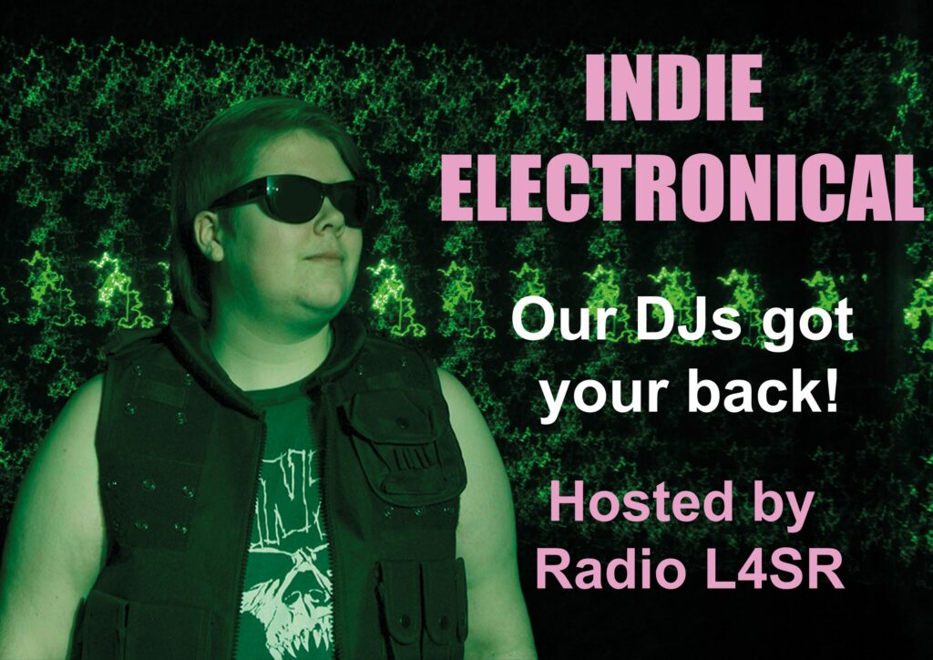
In this task we were to create an advertisment for a radio studio in a chosen genre. The options were;
We also had to create two versions; one printed and one online version. With the size of: 29.7 x 42 cm, 300 DPI (printed version) and 1050×900 px, 72 DPI (online version)
I chose music and created an Indie electronical ad. I used my friend, Kelly as the model and we took the shoots in their room, creating a homemade studio.
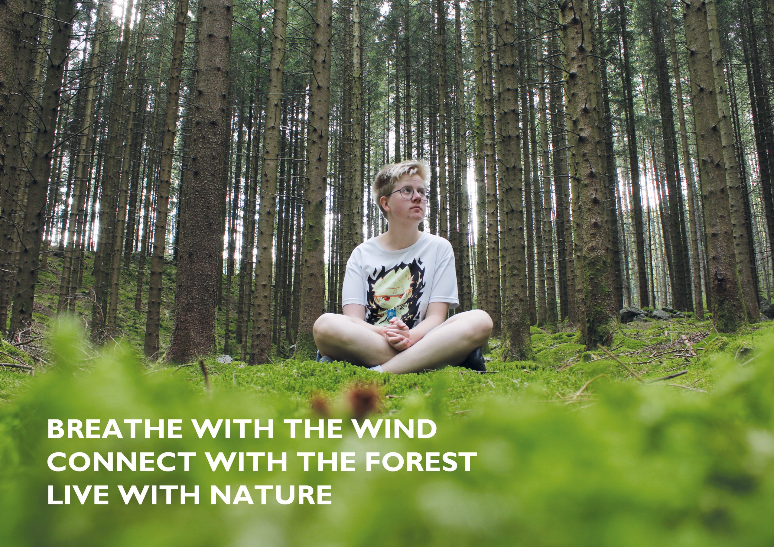
You will create an advert for a fictional client of your choice. Your photography will form the basis of this advertising campaign for the service or product. You must conceptualise and plan a creative photo shoot and produce the final advert.This image had to include a model in a landscape, starry or architecture background.
Apperture: f/8
Shutter speed:1/8 sec
ISO: 100
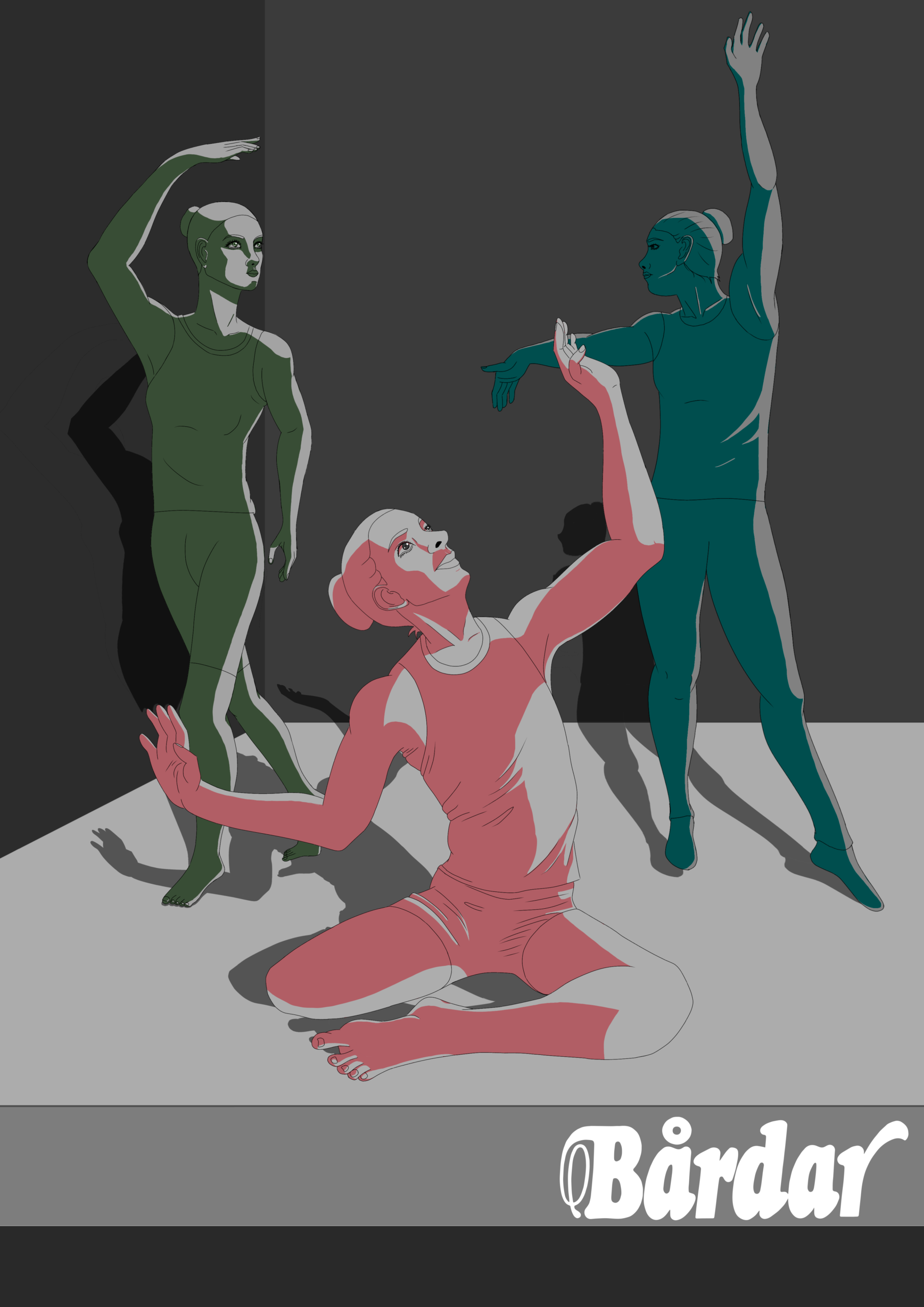
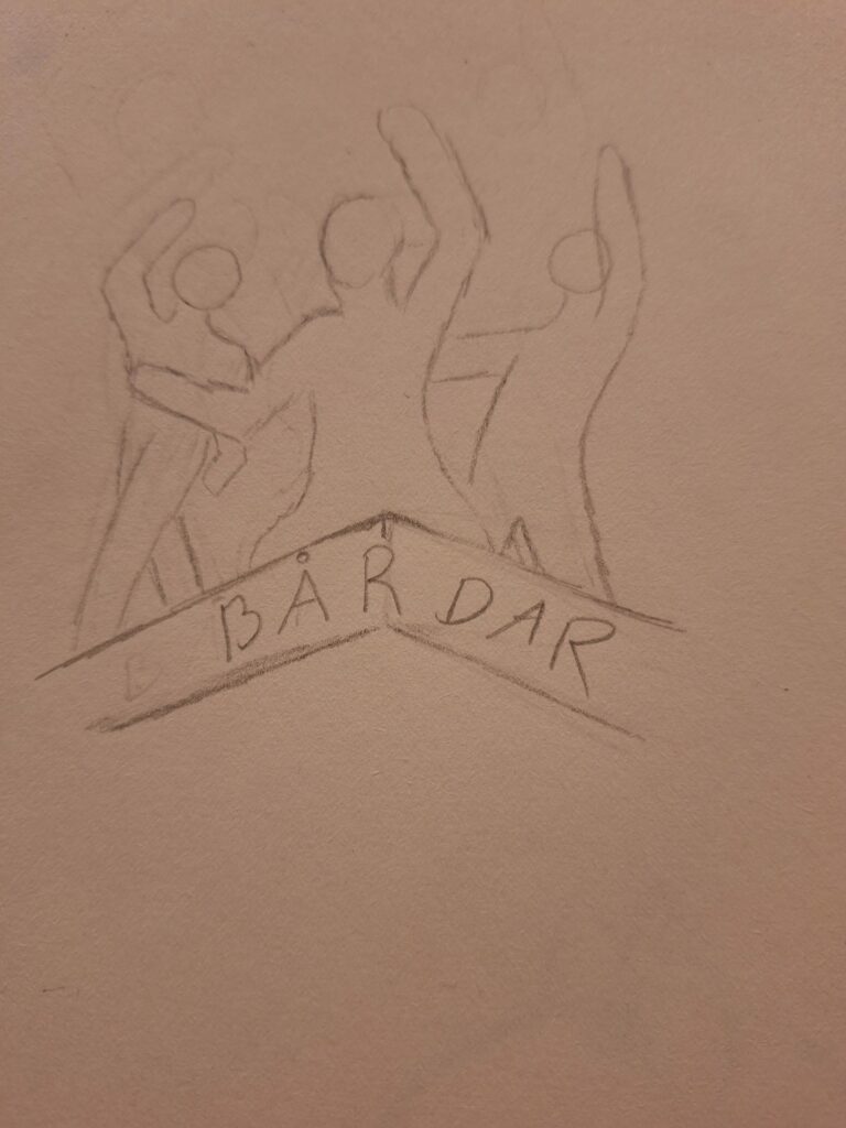
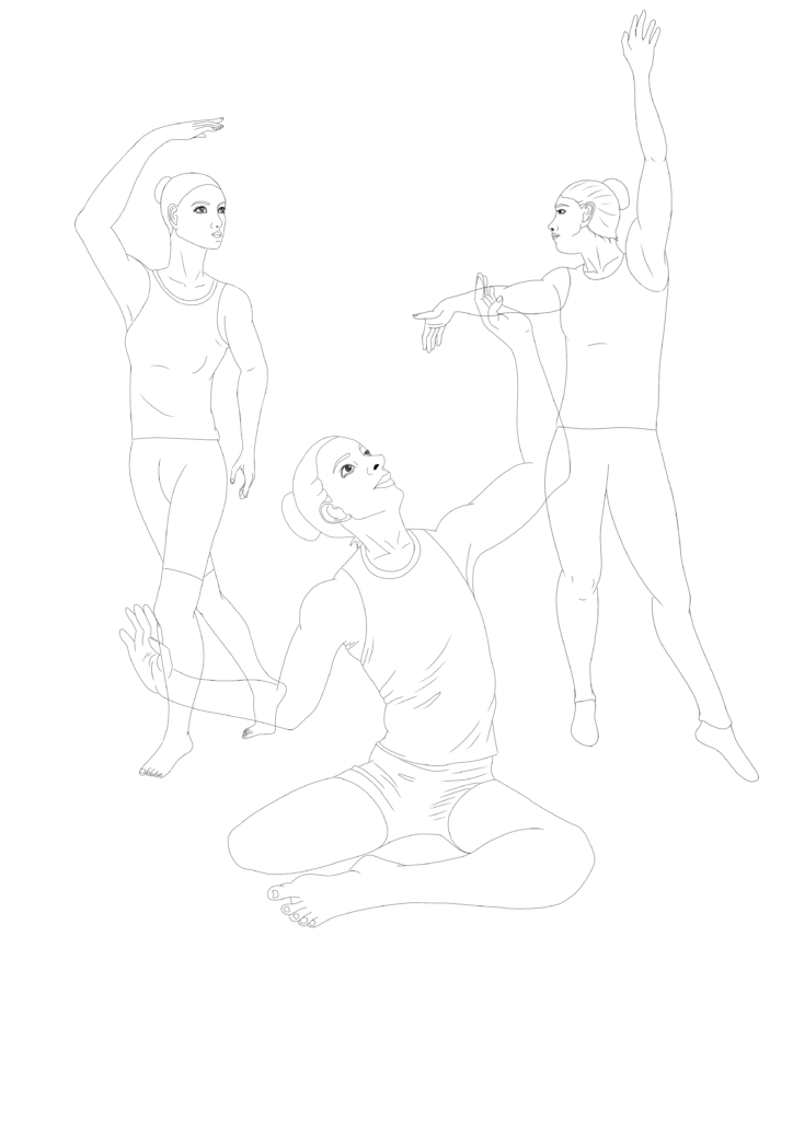
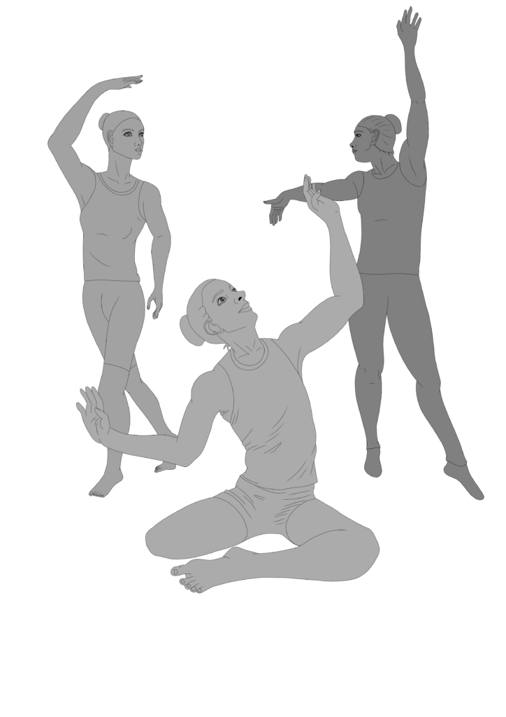
You will make an illustration to a poster for a dancing show for Bårdar. The poster must show at least three dancers in a realistic room. The people must be realistic in terms of each others and the room/scenery.

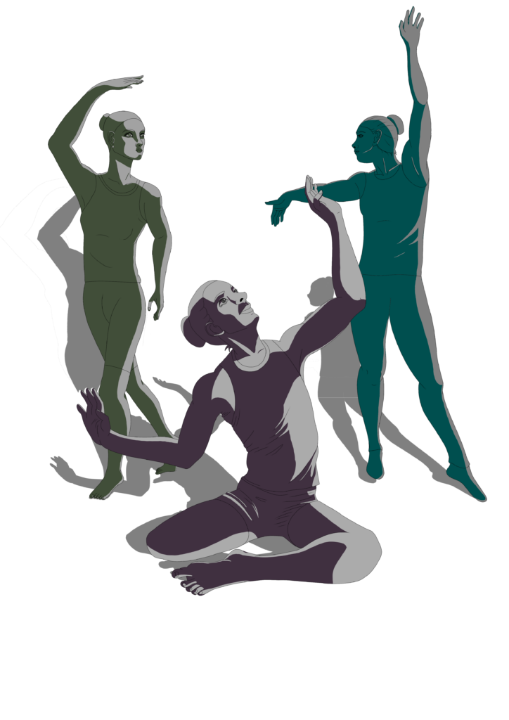
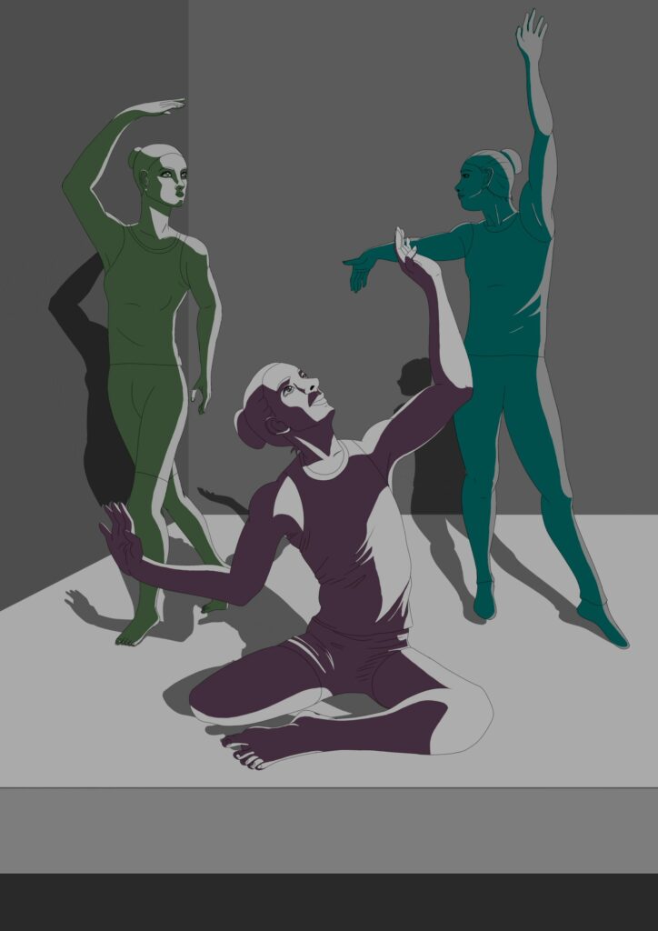
Together with the advertisment-students, we illustrated a drawing to their text. By co-operating we learnt how to work professionally with a client. We were challenged to get out of our comfort zone and dare ask for feedback and learn to handle critiques.
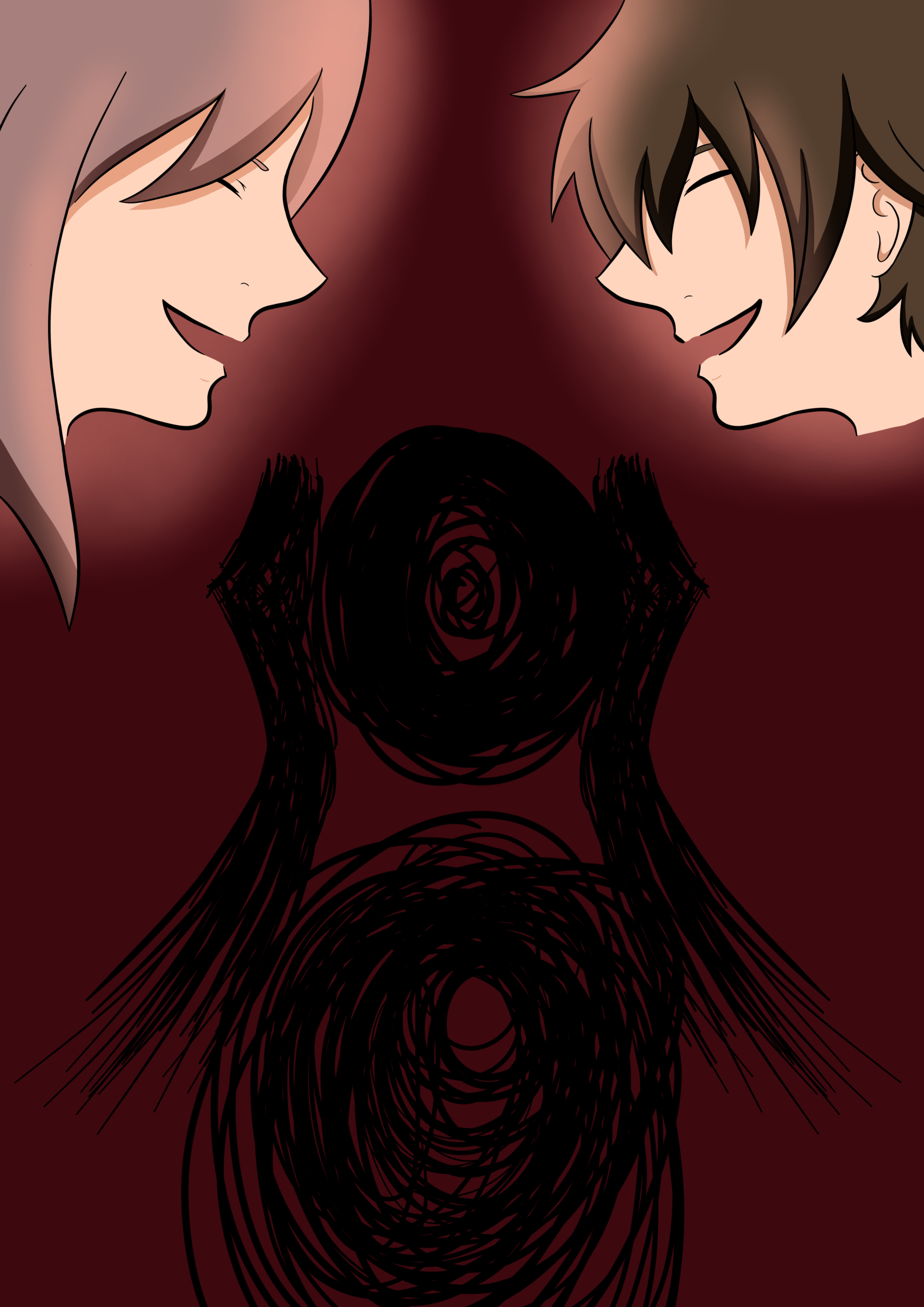
This drawing is based on a text by @schultzen.mehren. (English translation below):
[ ]
La oss skape et større liv
– sammen
Et liv med mening utover oss selv
La meg bli den jeg
Alltid var ment å være
Et for alltid før og etter
Jeg skjønner ikke hvordan lyden
Fra noen jeg elsker
Kan være så skremmende
At en hverdag
Uten planer føles som
En sprint uten slutt
Folk forteller meg at tiden
Må nytes før det er for sent
Jeg klarer bare å glede meg til det er over
Jeg lurer på om de heller
Kan holde kjeft
Gi meg det jeg trenger
Men hva jeg trenger
Er umulig å si for jeg vet
Ikke lenger hvem jeg er, kanskje har jeg aldri visst det
Jeg har blitt alt for noen
Mens jeg er ingenting for meg selv
Jeg har null kontroll
Translation:
[ ]
Let’s create a life
– together
A life with meaning beyond ourselves
Let me be the one I
Always was meant to be
One forever before and after
I do not understand how the sound
Of someone I love
Can be so scary
That a day
Without plans feels like
A leap without an end
People tell me that time
Must be enjoyed before it is too late
I can only look forward till it is over
I keep wondering if they
Could shut up
Give me what I need
But what I need
Is impossible to say because I know
Not who I am anymore, perhaps I have never known
I have become everything for someone
While I am nothing for myself
I have no control
In this assignment we had to build a website for an resturant from scratch. We had to make it in DreamWeaver by using HTML and CSS. We also had to create a wireframe and a prototype, and make the site responsive.
Prototype: n-Eat prototype (adobe.com)
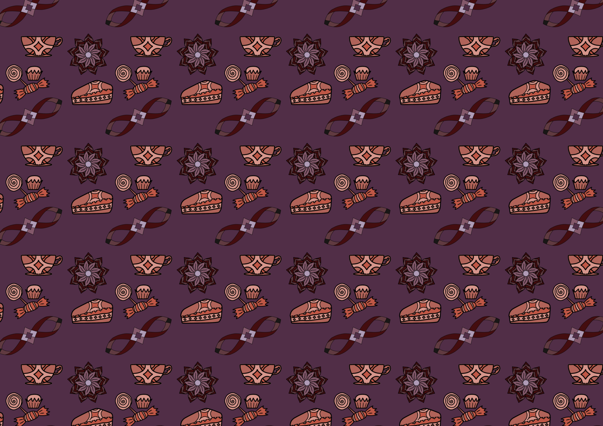
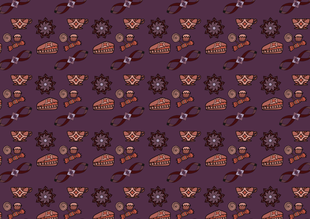
Six coffeehouse will open in Kvadratruten’s historical building. They wants an illustrator to create a pattern they can use on textiles, menus and decorations in the coffeehouse. They also wants to use the elements from the pattern on websited, social media etc., like Bendik Kaltenborn‘s illustration for Sommero hotel. Each cofffeehouse is associated with an epoch. You get one coffehouse to design for.
The six coffeehouses are:
Epoch: Neo-gothic